Formatting Tips to Make Your Grant Proposal a Standout
September 28, 2018
Just as you “dress for success” when you go for a job interview, your grant proposal should look pulled together and professional by the time you submit it. While an attractive presentation will not be enough to overcome weak content, if your proposal looks polished, it may incline the reviewer to rate your proposal more favorably. That said, a nicely organized proposal isn’t just about appearance: A properly formatted proposal will also be easier for the reviewer to read and understand.
Below are six formatting tips you can apply to your next proposal to make it look and read better.
TIP #1: CREATE TEMPLATES
We’ve talked about the value of using templates in other blog posts (see Managing the Proposal Draft Process: Templates & Communication Strategies to Keep You on Track). Starting a proposal from a template speeds up preparation. Additionally, templates can improve the appearance and uniformity of your proposals by establishing the fonts, colors, and graphic design styles that fit with your organization’s branding.
You can create templates for every piece of your standard proposal package, including:
the cover letter (header, footer, font, font size, outline for letter’s content)
cover page (font, default text, graphic use)
proposal body (headings, subheadings, header, footer, fonts, font sizes, page numbering)
annexes (e.g., organizational charts, CVs, page numbering, design of fly sheets)
budget
budget notes (cover page, table of contents, headings and subheadings, header and footer)
With each new funding opportunity, you'll need to carefully review the proposal guidelines to confirm that your templates comply with the instructions. To minimize the number of potential adjustments you’ll need to make for each proposal, it helps to create your templates with common proposal requirements in mind, such as using Times New Roman 12-point font for body text and 1-inch margins.
Content Guidance
In addition to establishing the font and margin formats, your templates can also include a general outline for the content.
For example, the template for the cover letter could include instructions on how many paragraphs to include and what to cover in each paragraph. CVs are another example. Many proposals require applicants to submit CVs for senior staff. Sometimes the CVs can run up to 4 pages, but often they are limited to 2 pages each. As part of your template development, you could create two CV templates, a short-form version and a longer version. If you create multiple CV templates, make sure each one covers the essentials, including education, work experience, publications, and references.
Proposal Structure
When creating the outline structure for your proposal template, do not exceed three tiers (i.e., heading, subheading 1, subheading 1a). If a proposal has more than three tiers, it can become difficult for the reader to follow the relationship between sections. As an example, your generic outline might look like:
A. Heading
I. Subheading
a. Details
b. Details
c. Details
II. Subheading
a. Details
b. Details
c. Details
B. Heading
I. Subheading
a. Details
b. Details
c. Details
II. Subheading
a. Details
b. Details
c. Details
If the proposal opportunity you are responding to instructs you to develop an outline of more than three tiers, you obviously need to do this, but to the degree that you can choose your own structure, try to minimize the number of subheadings. Subheadings should help explain the relationship among concepts. What you don’t want is for the subheadings to separate closely related concepts in a way that feels forced or obscures their relationship.
Proposal guidelines usually list what the proposal’s major headings should be (e.g., Introduction, Background, Activities, etc.), so that part is straightforward. What’s not always easy to determine is how to structure and label the subheadings. When in doubt, start writing the proposal with no more than two levels identified. After you have some text to work with, you’ll be in a better position to decide whether you need a third tier and how to title it.
Intentional Design
To allow enough time for the design process, templates should be developed outside of an active proposal process. When you are working on a proposal, you’re under pressure, and things can get frenzied, which isn't an optimal setting for making thoughtful design choices.
Template design is an iterative process, not a one-off task. After you create drafts of your templates, you’ll need to use them for a few proposals to see how easy it is to work with them; it’s also important to make sure your colleagues like the templates and find them intuitive to use.
After using the templates on a few live proposals, you should have enough feedback to revise the designs. Until you have a collection of templates you’re happy with, you’ll need to keep going through the process of revising the templates, using them for live proposals, collecting feedback from the proposal team, and revising again. The end result of this process should be templates that are attractive, intuitive to use, and encourage best practices for proposal development.
Design Preferences and Formats
As you work on your templates, you’ll want to talk to your colleagues about design preferences such as:
Do we want to use a photo on the cover page? If so, what are allowable sources for the photo (e.g., is it okay to use stock photos)?
Do we want our proposal to use color graphics and fonts, or should it be black-and-white? (Note: black and white is safest for electronic submissions if the funder is likely to print the proposal in black and white; or, in the case of hard-copy submissions, if you think the funder will see the use of color as extravagant because it increases printing costs).
Do we want more than one template for any of the standard sections, such as the cover page (e.g., one version with space for a photo and another version with all text)?
Another choice includes how to design the templates. If you work with people who have limited Microsoft Word skills, you may want to develop a “model” document that people can refer to, including the right fonts, colors, and text box styles. To use the template, the proposal writer would make a copy of the model document, type over the sample text to preserve the font styles, and create text boxes by copying the text box example included in the model document and pasting it into the appropriate spots in the proposal draft.
If you work with colleagues with more advanced Word skills, you could create a template that relies on Word’s style toolbar (see image below). The style toolbar lets you lock in the font style, size, and color for different kinds of text, from headings and subheadings to captions, text box headings, and bulleted lists.

Proposal Templates 101: Want to learn more about creating proposal templates? Click below to access our free tutorial on how to create three proposal-related templates: a proposal narrative template, a cover sheet, and a checklist template.

TIP #2: USE WHITE SPACE
One of the easiest ways to improve the readability of your proposal is to add white space. You can add white space by making a concerted effort to separate your text into shorter paragraphs. You can also add white space by creating buffers around graphics and within and between sections.
We all know it’s easier to read text that is comfortably spaced. However, when faced with page limits, it’s tempting to adjust the spacing between sentences, or even between letters (kerning), in an attempt to squeeze in more text. Resist this temptation. Reducing the spacing will violate the funder’s guidelines if the instructions direct you to use single-spacing. The text will also look cramped and be harder to read.
If you need to adjust the line spacing, you can do so by navigating to “Home” in the Word toolbar and clicking on the spacing menu.

In the examples below, you can see that once you get down to 11-point spacing between the sentences, the tails of letters like “p” and “g” are starting to get cut off as the sentences run into one another.
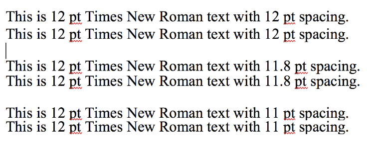
Could you get away with 11.8 spacing, as shown in the second example above? Possibly. However, reviewers will probably spot the condensed spacing and may flag your proposal as being non-compliant, which means it runs the risk of being thrown out and not considered for funding. Given the high stakes, you may want to think twice before adjusting the spacing. The best policy is to design your template to be single spaced and adjust as needed to follow the funder’s guidelines.
One spacing change that will attract less attention is the spacing between paragraphs. Proposal guidelines usually stipulate the spacing between sentences, but not the spacing between paragraphs or between a table and the paragraph below it. As with other changes, you don’t want to go to extremes, but you could try making slight adjustments if you need space to fit in a sentence or two.

TIP #3: LIMIT COLORS
Incorporating color can make your proposals look more interesting. However, when it comes to text, for the most part, boring is better. Using black text for body text is standard practice, and you should create your template to follow this rule.
For the headings and subheadings, you have more freedom to use a little bit of color. For main headings, you can use the default blue color found in Word’s style bar, or you can use a color from your organization’s palette of official colors.
You don’t want to go too crazy with color, so a safe choice might be, for example, to switch out Microsoft’s default blue for Heading 1 (seen in the example above) for a blue that is part of your organization’s approved color palette. Or, you could use a color from your palette for one of the three levels of headings and use Word’s default settings for the other headings.
Limiting your colors also applies to graphics. If you include graphics in your proposal, they should focus on colors from your organization’s color palette.
When you prepare your proposal templates, it’s helpful to include guidance on your organization’s color palette. To ensure consistent branding across your organization’s proposals, provide the RGB code for each color in addition to showing a sample of the color.
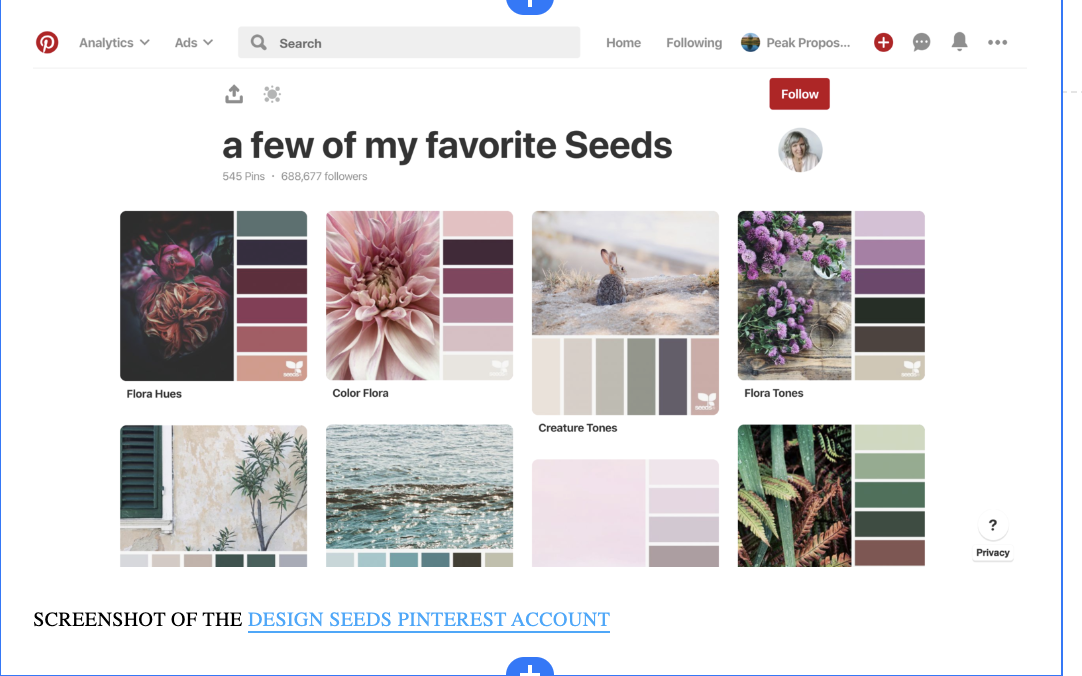
If you don’t have a color palette, one way to create one is to pull colors from your organization’s logo. Next, you can add a few complementary colors to expand the range. If your organization doesn’t have a graphic designer, you can use online tools to create a color palette. The website Design Seeds is a fun resource for color inspiration. The website showcases color combinations created by analyzing photographs. (Design Seeds is no longer active, but you can still look at its color suggestions on Pinterest.) Another website that offers similar features to Design Seeds for choosing a color palette is https://coolors.co/.
You can also use a free service like Color Code Picker to analyze the colors in a JPG of your logo or a photograph you like.
TIP #4: CHOOSE STANDARD FONTS (NO MORE THAN THREE)
When you develop your templates, you’ll have to designate the default font style for every element of the proposal, including graphics, text boxes, tables, captions, and footnotes. Because printers, computers, and PDF readers do not share the same library of fonts, it’s best to build your templates with standard fonts that you can count on displaying correctly, such as Times New Roman and Arial.
To increase the readability of your proposal and to prevent it from looking too “busy,” it’s best to use no more than three fonts in your proposal template.
A suggested list is:
Arial for headings (e.g., font size 16 for Heading 1 and size 13 for Heading 2)
Times New Roman 12 point for body text
Arial 9 point for text in tables, graphics, text boxes, captions, and footnotes
Note that some proposal guidelines will limit you to Times New Roman 12 point for everything, while others will allow you to choose a smaller font for things like text boxes and tables. Your template provides a tentative structure for a proposal. To ensure that you prepare a compliant proposal, always check your template’s default settings against any style guidance provided by the funder.
Proposal guidelines often allow the use of smaller font sizes for graphics, text boxes, and tables. To ensure readability, do not use a font smaller than Arial 9 point.
TIP #5: INCORPORATE GRAPHICS (VERTICAL LAYOUT WHEN POSSIBLE!)
Using graphics in your proposals can help their visual appeal and be an effective way to communicate information.
Some proposal experts suggest dedicating up to 50% of a proposal to graphics (which can include tables as well as infographics like the one below). While the 50% figure seems a little excessive, graphics can be an efficient use of space, provided they take up less space than the equivalent information in text format. If it would take two paragraphs to explain a process that you could show in a single small graphic, go with the graphic. If the graphic consumes half a page, it may be better to rely on text to convey your message.

TIP #6: USE BULLETED LISTS
In proposals, magazine articles, and blog posts, bulleted lists are a mainstay. Bulleted lists are a popular way to communicate information because they are faster to scan than densely written paragraphs.
Bulleted lists also introduce more white space into a document, which helps readability. Another advantage of bulleted lists is that they encourage brevity. Although the information conveyed may be identical, items in a list tend to be written more concisely than sentences in a paragraph.
As an example of how this could work in a proposal, let’s take the paragraph above and make it into a list. Since it’s a short paragraph, turning it into a list won’t save much space, but the list format may improve the readability (or scan-ability) of the content.
Bulleted Lists
In proposals, reports, magazine articles, and blog posts, bulleted lists are a mainstay. Bulleted lists have many advantages:
Lists are faster to read than densely written paragraphs.
Bulleted lists introduce more white space into a document, which increases readability.
Lists encourage brevity.
While bulleted lists are useful, just as with graphics, you want to use them judiciously. Your proposal will not read well if every other paragraph is a bulleted list. If you find yourself writing a long paragraph that consists of several closely related elements, such as the equipment needed for a project, that’s an excellent time to introduce a list. On the other hand, if you have a paragraph that covers multiple subjects or items that have complex or indirect ties to one another, a list probably is not the best approach.
Before you create a numbered list, stop and ask yourself whether you are outlining the order of steps or trying to communicate a relative value among the items. If the answer is no, go with plain bullets.
Final Suggestions
Creating proposals that are engaging and easy to read requires solid, well-written content, logical transitions among sections, effective graphics, and consistent formatting.
One way to ensure that all of these elements are present is to develop a proposal template. Another way to ensure your proposals are of high quality is to develop a style guide that serves as a reference for you and others in your organization. The style guide can cover everything from how to spell certain words to which font style to use. To create your own style guide, check out our blog post How to Create & Use a Style Sheet for Grant Writing. You can also find tips about creating a style guide on the website Daily Writing Tips.
The traditional grant writer’s toolkit used to consist of a core set of tools: Microsoft Word, Excel, and PowerPoint, and Adobe Pro. Things have changed, and nonprofits and grant writers have many options for writing, sharing, designing, and collaborating beyond Microsoft and Adobe. We’ve profiled several options below, all produced by companies based outside the United States.